Generating portfolio for Alfie Martin...
8%
Polaroid
Reimagined.
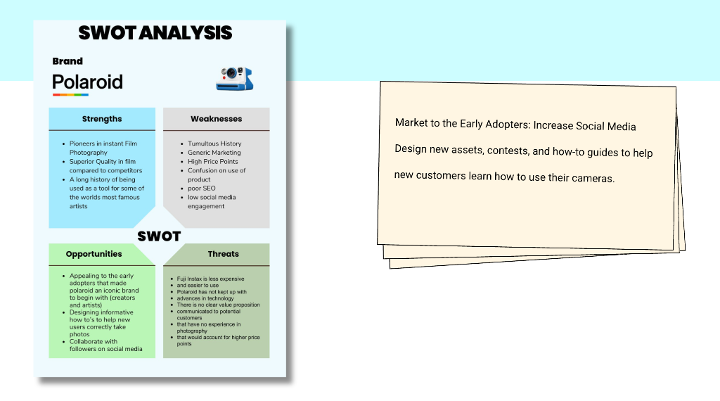
Seth Godin once said "Marketing to everyone is marketing to no one". That was the overarching root cause of the problems Polaroid was having since they returned to the market:
Video Narration
"what does it take to capture a moment it takes light to illuminate the moment? what we see and what we feel it takes chemistry to turn that light into matter and passion to continuously evolve our process a Polaroid photograph is a beautifully complex thing where each light-sensitive negative is made up of 15 layers thinner than a hair and designed to mimic the human eye the image comes to life as the dyes activate painting a photograph from right before our eyes it is the magic that happens at the intersection of art and science:"
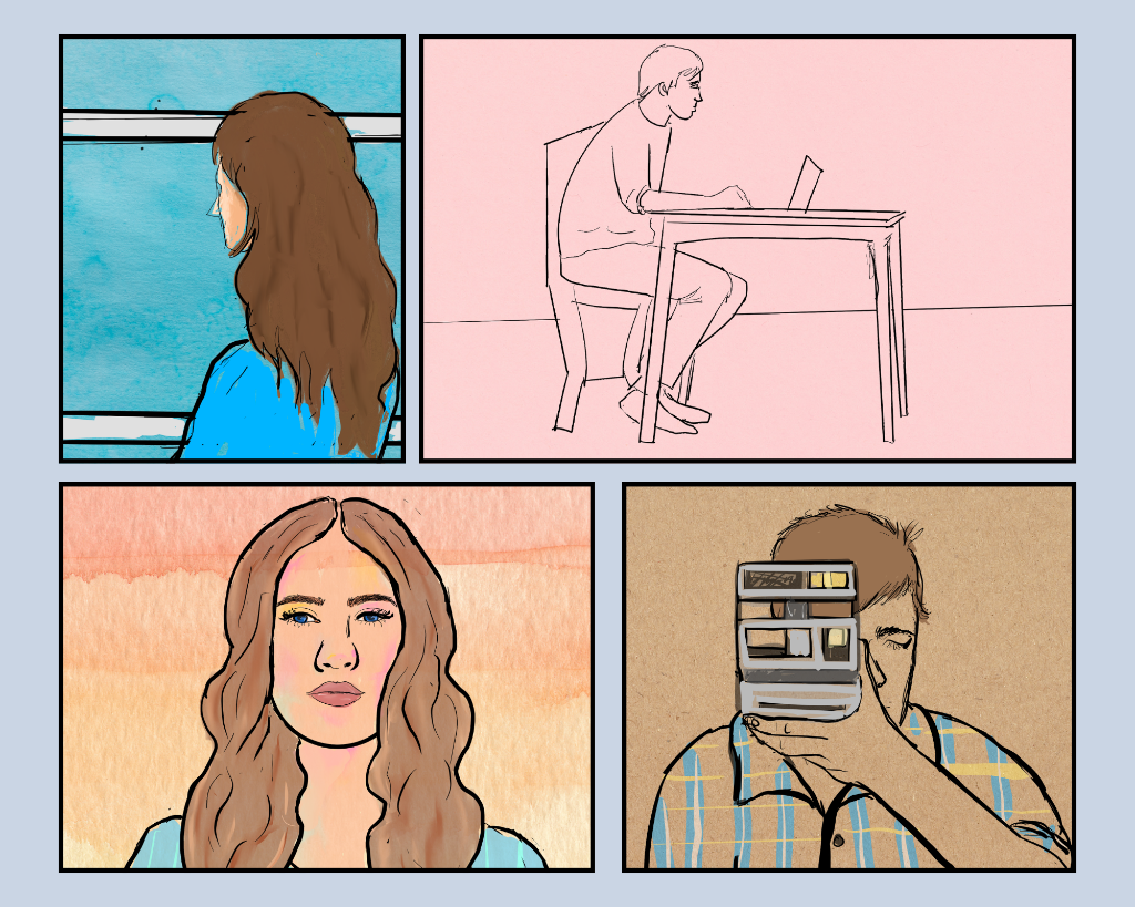
Early Storyboard Concept drawing
Watch with Sound on
The Challenge.
When Polaroid returned to actively selling products after its extended hiatus, the brand faced a paradox that most companies would envy and dread simultaneously: everyone knew the name, and almost no one knew what it stood for anymore.
The challenge wasn't recognition it was relevance. Polaroid had become nostalgia without a body, a feeling without a product. My job was to give that feeling somewhere to live again, and to build a growth strategy that could convert sentiment into sales.
I needed to identify the people who had made Polaroid iconic in the first place the early adopters, the artists, the experimenters and give them a reason to come back. Not as a retro curiosity. As something that still meant something.
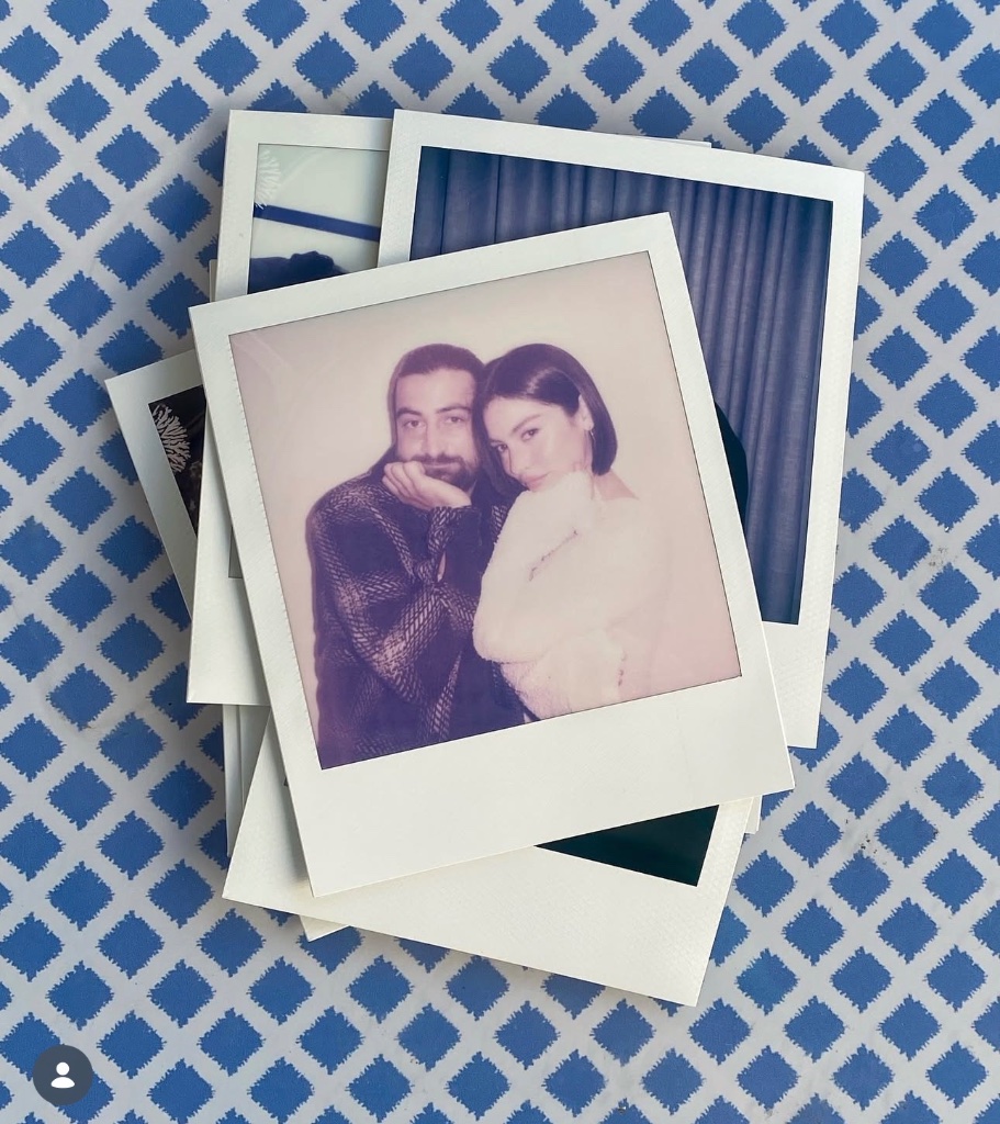
"The brand had become nostalgia without a body a feeling without a product."
Designing for the People
Who Invented the Culture.
I began by going back to the source. Polaroid's original audience wasn't nostalgic they were radical. They were artists who wanted immediacy, experimenters who liked happy accidents, and innovators who believed a photograph you could hold in your hand, still warm from the camera, was a different thing entirely than one you sent to a lab.
I redesigned the brand identity to speak directly to that lineage. The visual language I developed honored the physical and tactile qualities that made Polaroid distinct the frame, the weight of the paper, the specific color quality of instant film while stripping away the layer of kitschy nostalgia that had accumulated over the hiatus years.
I centered the identity on physicality the frame, the texture, the immediacy of a print in hand. Every design decision was anchored in what makes an instant photograph irreplaceable.
I positioned the brand not as a relic but as a living creative tool. The identity spoke to makers and early adopters the community that built the brand's original cultural gravity.
Sentimentality was a lever, not a crutch. I built it into the content design and strategy as a purposeful emotional mechanism not a default aesthetic.
I infused the content design with a deliberate sentimentality not the soft-focus, sepia-toned kind, but something more honest. The kind of feeling you get when you find an old photograph in a drawer. The brand voice I developed was warm without being saccharine, and specific without being niche.
Sentimentality as Strategy.
I approached content strategy as an emotional architecture problem. The question wasn't what to post it was what to make people feel, and in what sequence, so that purchasing film felt like a natural extension of that feeling.
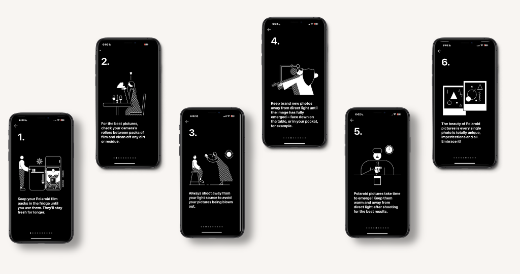
I built a content system anchored in specific emotional beats: the moment before a photo is taken, the wait while it develops, the ritual of sharing a physical print with someone. These beats became the rhythm of our content calendar and the framework for how we approached every touchpoint.
By mapping content to emotional states rather than product features, I was able to connect the brand to something more durable than trend cycles the fundamental human desire to hold a moment still.
Reestablish the Emotional Contract
Content that reminded the audience what Polaroid had always been about not a camera, but a way of seeing. Archival imagery, artist voices, community memory.
Connect Feeling to Product
Introduced film and hardware through the lens of experience what it feels like, not what it does. Soft product integration through community-submitted content.
Activate the Purchase Loop
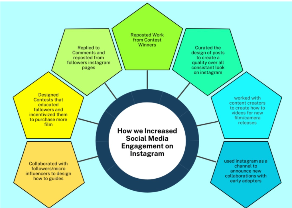
Instagram contests, limited edition collabs, and community challenges created urgency and desire with film purchase as the price of participation.
Turning Instagram Into a Film Counter.
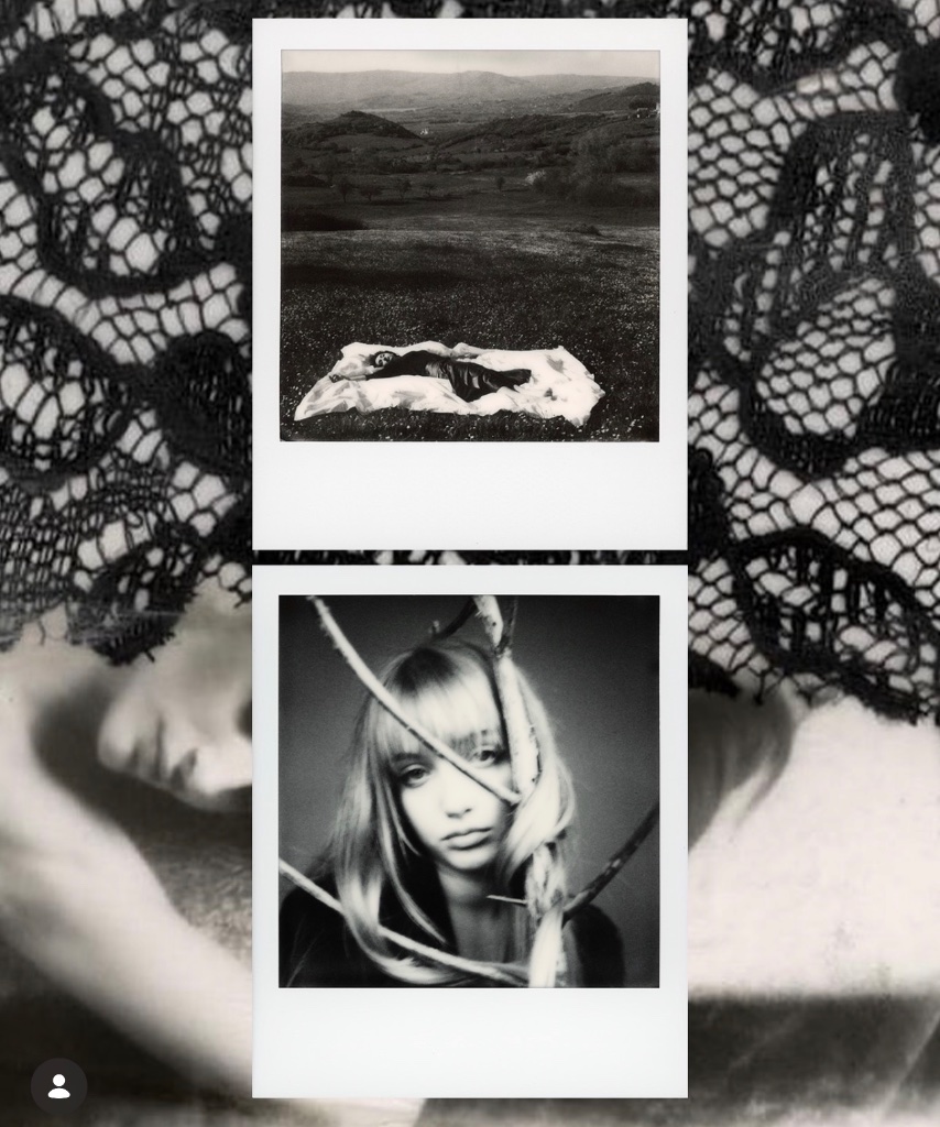
The insight I was working from was simple: Instagram had become the place people went to see photographs, but Polaroid was about making them. The contest structure I designed was built to bridge that gap to make participating on Instagram inseparable from purchasing and using film.
Every contest I designed required participants to shoot on Polaroid film to enter. No filter aesthetics, no digital simulations entries had to be scans or photos of actual prints. Film purchase became the cost of participation.
Rather than tying campaigns to retail calendar moments, I developed thematic prompts memory, discovery, accident, light that activated the creative community and generated submissions that functioned as organic brand content.
Contest entries were featured and amplified by the brand, turning participants into ambassadors. The loop: follow → buy film → shoot → submit → get featured → encourage others to follow.
"I designed the contests so that using a Polaroid camera was the only way to have a voice in the community we were building."
The contests served a dual purpose: they drove film sales directly, and they generated an enormous volume of authentic, community-created brand content that populated our feed and kept the emotional register of the account exactly where I wanted it alive, specific, and physical.
Partnerships That Meant Something.
The collaborations I pursued weren't about borrowed heat they were about shared DNA. I looked for partners that had their own relationship to the ideas Polaroid stood for: immediacy, craft, cultural specificity, and the handmade. The two most significant partnerships I developed were with the Keith Haring estate and with Fendi.
Keith Haring Estate
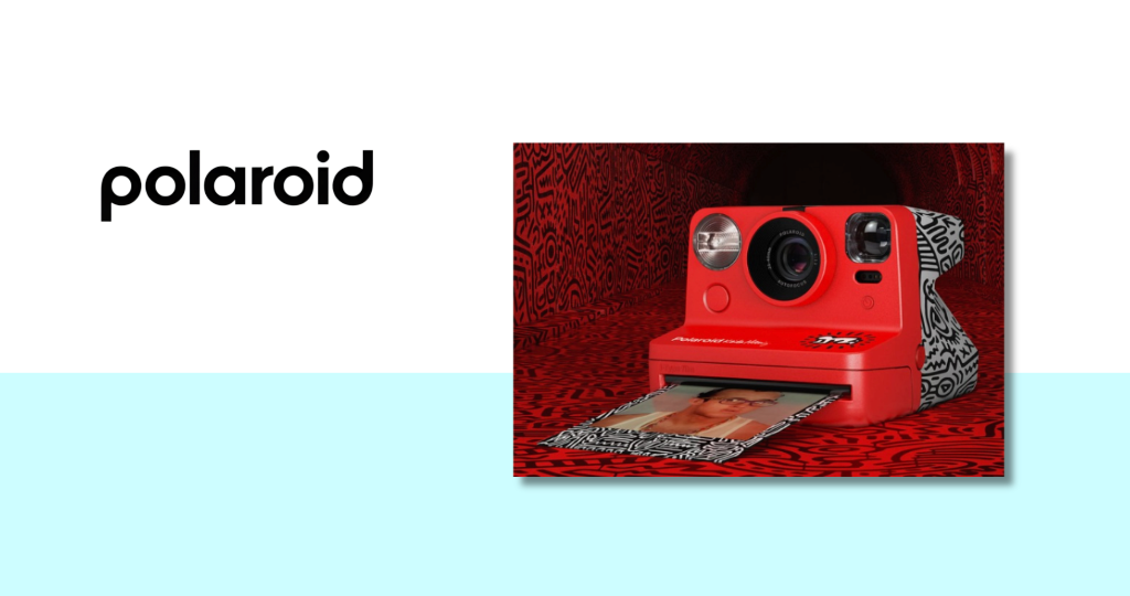
I partnered with the Keith Haring estate to develop a collaboration that reconnected Polaroid to the New York art world that had embraced instant photography as a medium in the 1980s. Haring had famously used Polaroids as a documentation and creation tool, and the collaboration was rooted in that authentic history. The resulting product and content series honored the estate's brand standards while giving Polaroid a direct line back into the fine art conversation. More than a licensed print run, this was a story about how two visual cultures had always been in dialogue.
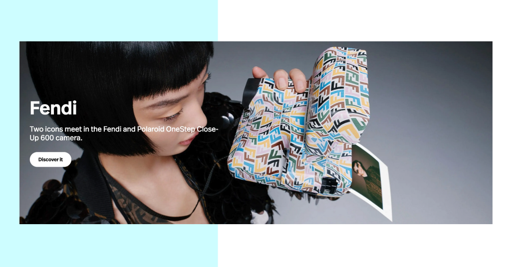
Fendi
The Fendi collaboration was built around a different kind of logic: the luxury of the impermanent. I developed the partnership around the idea that Polaroid and Fendi shared a commitment to craft, to the physical object, and to the idea that what you make with your hands has a value that reproduction can't capture. The collaboration gave Polaroid entry into a luxury lifestyle conversation without compromising its roots and gave Fendi a way to articulate its own relationship to analog values in an increasingly digital world. The campaign visuals I designed for the partnership lived at the intersection of both brand worlds with deliberate precision.
Every partner I brought to the table had a genuine historical or philosophical relationship with what Polaroid represented. The partnerships were credible because they were earned.
The collaborations moved Polaroid from the nostalgia shelf into the contemporary cultural marketplace where its strongest potential buyers already lived.
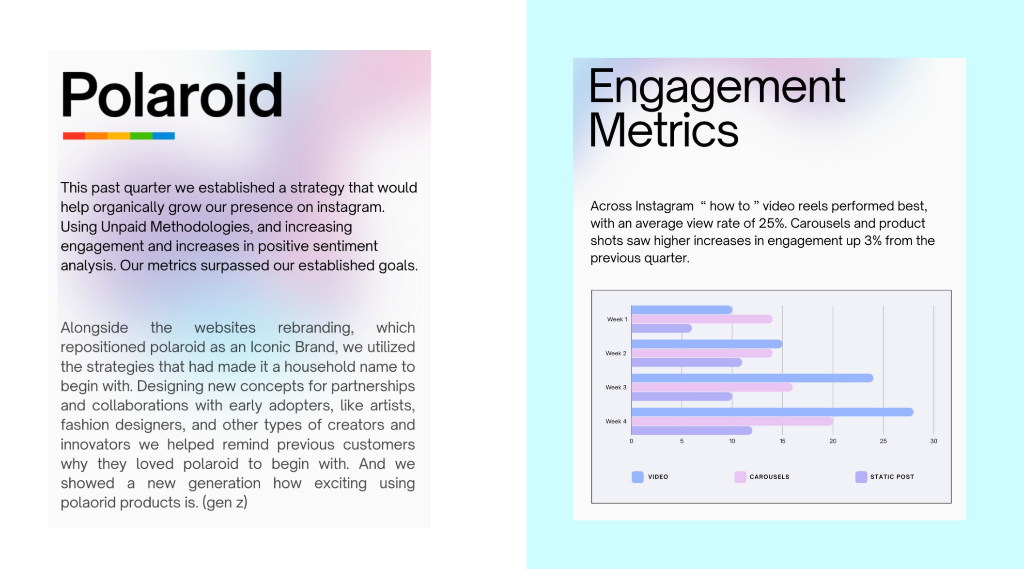
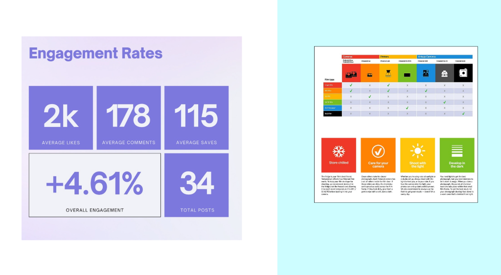
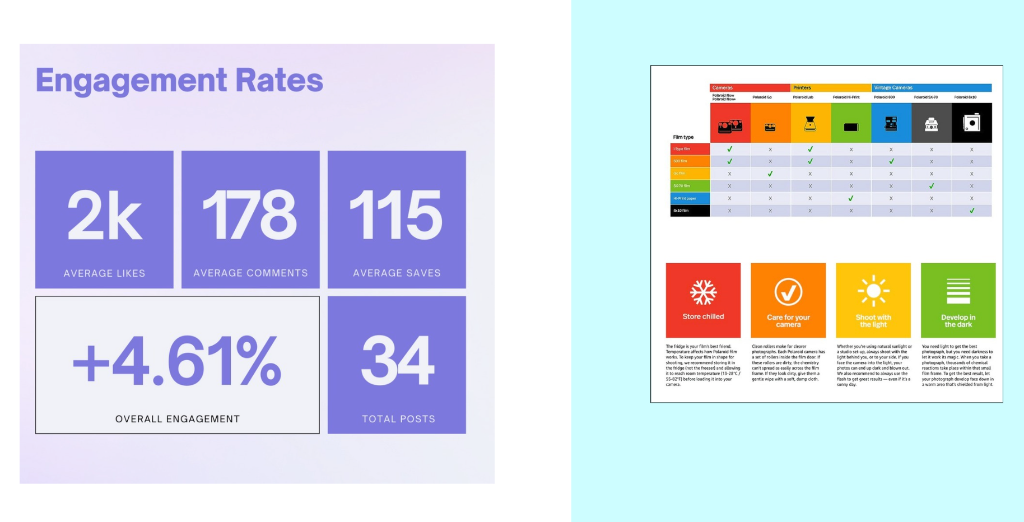
What I Learned.
The Polaroid project taught me that the most complex brand problems are rarely about awareness. People knew Polaroid. The work was about belief rebuilding the conviction that this thing was still worth caring about, still worth spending money on, still worth getting your hands on.
Growth design, in that context, meant something specific: it meant understanding that the path to purchase ran through feeling, and that feeling had to be designed with the same precision you'd apply to a funnel or a conversion rate. The contests, the identity, the collaborations each one was a designed emotional argument.
What I came away with was a sharper understanding of how legacy brands create permission. When you have a brand with real cultural history, you don't invent relevance you excavate it. You find what was always true about it, strip away what accumulated on top, and hand it back to the people who made it matter in the first place.