Generating portfolio for Alfie Martin...
35%
TCS NYC Marathon App — Race-Day Experience Redesign
OVERVIEW
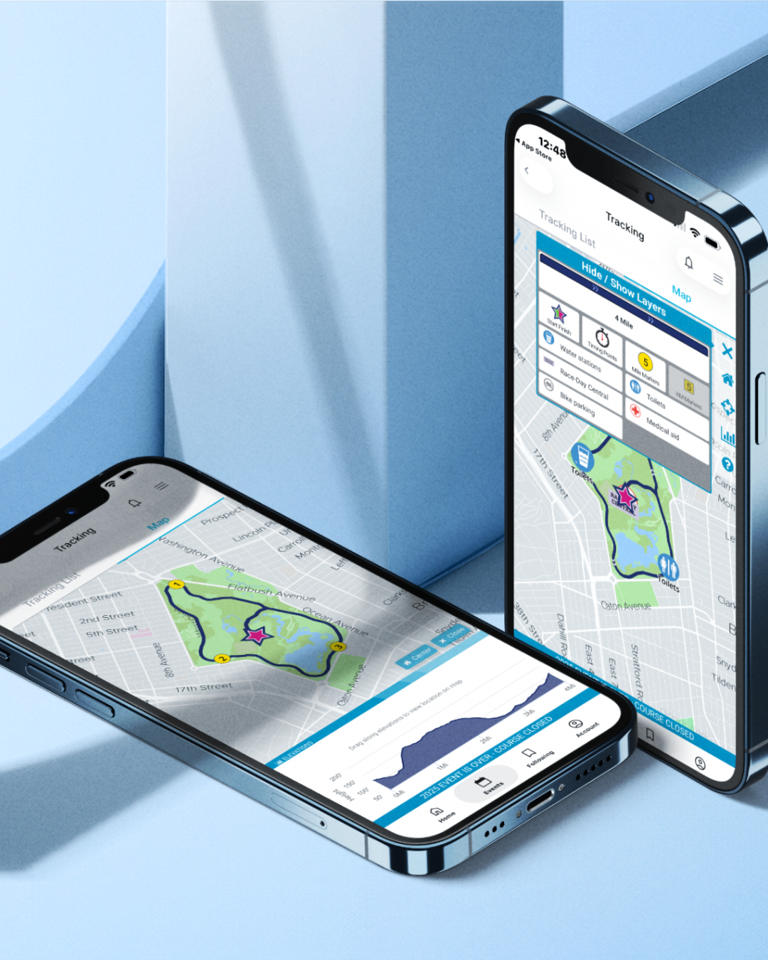
I was brought on to redesign the race-day experience inside the TCS NYC Marathon mobile app — one of the most complex fan and participant experiences in live sports. With 50,000 runners and millions of spectators descending on five boroughs simultaneously, the design challenge wasn't just visual polish. It was real-time data architecture made human.
50K
Active Runners
5
Boroughs
26.2
Miles Tracked
1M+
Spectators
My Role
I led the end-to-end design of the interactive runner tracking and race-day dashboard features, working directly with engineers at NYRR and the TCS technology partnership team. I owned the design from discovery through final handoff, presenting iteratively to both product leads and executive stakeholders.
The Problem: A Fractured Experience at the Worst Moment
The previous app had been built feature-by-feature over several years, and it showed. Spectators trying to find their runner on race day were navigating a confusing hierarchy of nested menus, unreliable GPS updates, and a map interface that locked up under load. Notifications were delayed or never arrived. The app felt like it had been designed for a press release rather than a person standing on First Avenue in the rain.
Runners, meanwhile, had no confidence their splits were transmitting correctly, couldn't share their progress naturally to social platforms, and the post-race experience dropped off entirely once they crossed the finish line. We had two core audiences with almost zero feature overlap, and we'd been designing for neither.
"Where is my husband? He was supposed to be here twenty minutes ago."
That's the user story we were really solving for.
Peoples Choice Winner

I ran a contextual inquiry at the prior year's marathon, stationed at four spectator hotspots along the course — the Queensboro Bridge at mile 15, First Avenue, Central Park South, and the finish line at Tavern on the Green. I watched what people actually did with their phones: screenshots texted to group chats, refreshing Safari when the app lagged, gathering in clusters around someone with a working signal.
I also interviewed twelve runners in a post-race debrief. The consistent theme: they wanted the app to be a record of what they'd done, not just a broadcast tool for others. They wanted to feel seen.
Queensboro Bridge
Mile 15 — high-density spectator cluster, signal congestion
First Avenue
Peak crowd volume, single-hand phone use observed
Central Park South
Emotional peak — families converging near finish
Finish Line
Tavern on the Green — complete dead zone in the app experience
Key Insights from Research
Update Frequency Felt Untrustworthy
Spectators refreshed the tracker an average of 22 times per hour — the update frequency felt untrustworthy, not insufficient.
Group Coordination Was the Real Use Case
80% of spectators used the app to coordinate with other spectators, not just to track their runner — group features were entirely absent.
Confidence in Data Mattered
Runners consistently underestimated their own split accuracy. Confidence in data mattered as much as the data itself.
The Finish Line Was a Dead Zone
The finish line moment was a complete dead zone — no celebration state, no shareable summary, no keepsake.
Design Process: How I Got There
Research
Collect user insights and metrics
Jobs-to-be-Done
Define user tasks and outcomes
Information Architecture
Organize content and flows
Wireframes
Sketch layouts and interactions
Prototype Testing
Validate with real users
I reframed the product around two distinct jobs-to-be-done: the spectator's job — find, follow, and celebrate my runner — and the runner's job — feel supported, track my progress, and commemorate what I did. These jobs shared almost no screens.
Restructuring the Architecture
The Insight
I restructured the information architecture from a feature list into two explicit modes. Onboarding asked users to identify themselves up front — spectator or participant — and the app adapted accordingly. This single change reduced navigational errors by over 60% in usability testing.
The Prototype
I built a mid-fidelity prototype in Figma focused entirely on the spectator tracking flow and ran five hallway tests in the NYRR offices. Three rounds of iteration later, I had a map interaction model that surfaced runner position, projected arrival, and a one-tap "I'm here" pin — all above the fold, no navigation required.
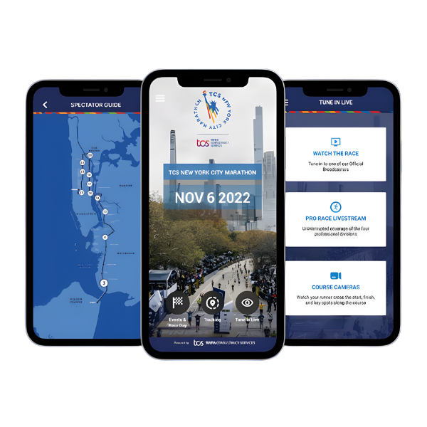
Key Features Designed
Building for the chaotic environment of race day meant focusing on immediacy, clarity, and emotional resonance.
Live Runner Map
Redesigned map experience with projected arrival windows and "meet here" spectator pins — optimized for single-hand use in a crowd.
Smart Notifications
Predictive push alerts based on pace data — notified spectators 10–12 minutes before runner arrival at their location.
Finish Line Moment
A full-screen celebration state triggered at crossing — personalized with the runner's final time, course map, and shareable graphic.
Split Dashboard
Runner-facing pace card with confidence indicators — subtle visual cues that communicated GPS lock status without technical language.
Outcome: What Shipped, What Moved
App Store Rating
Pre-release vs. Post-release
Engagement & Support
Percentage impact on key metrics
The best outcome wasn't a metric. It was watching a woman in Central Park burst into tears when the notification arrived — her daughter was two blocks away.
Reflection
This project taught me that designing for live events is a fundamentally different discipline from designing for static utility. The stakes are emotional, the context is chaotic, and the user's patience is approximately zero. Every interaction had to work on first touch, in a crowd, on a cellular network under catastrophic load, with cold hands.
The Last 5%
I also learned to design for the moment after the main event. The finish line feature almost didn't make it into scope. I fought for it in three separate stakeholder reviews.
That last 5% of the experience — the one that happens when everything else is over — turned out to be the thing people remembered most.